Over the last month or two, Xamarin has run two challenges involving completing small tasks with upcoming Xamarin.Forms 4 features - the Visual Challenge and the CollectionView Challenge. As a relatively staunch "Xamarin Native" developer that finds himself using progressively more Forms Embedding as time passes, I thought these would be good opportunities to check out the new features and catch up on Forms progress. Below I've included the submissions I made for each challenge.
Visual Challenge
Arranged by David Ortinau - Senior Program Manager on the Forms team and deliverer of many an entertaing presentation - the Visual Challenge was centered on the new Xamarin.Forms 'Visual' feature, which aims to provide a visually identical, or nearly identical, UI experience on iOS and Android out of the box. Visual is realised through 'themes', the first one being focussed on by the team being a Material Design style.
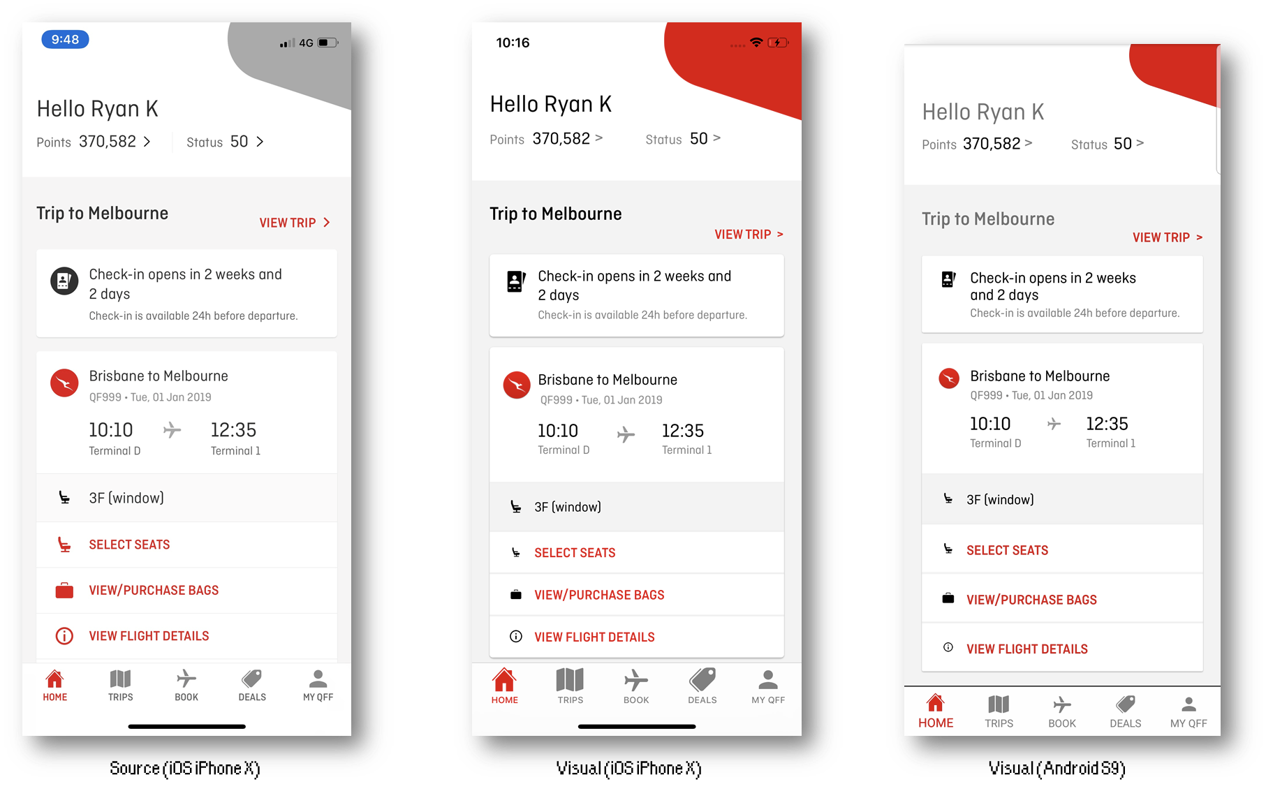
The ask of the Visual Challenge was to use the new feature to replicate an existing screen and provide a comparison of the iOS and Android outputs as well as a write up on the experience. For the challenge, I chose to use a screen from the Qantas Frequent Flyer app, an app I regard to be quite asthetically pleasing. Though I didn't strive for a perfect reproduction (e.g. notice that I didn't recolor some images), the results overall were pretty good:

The screen was easy to reproduce using Xamarin.Forms layouts and controls. For me it highlighted the importance of a good clean design, and how sensible defaults (which Material Visual offers over stock XF) can guide the user towards that. My primary piece of feedback on Visual was that defaults for some controls (like Label.TextColor) were not the same between platforms, which the team is planning to address. The other thing I would have liked is a more consistent tab bar appearance, and/or ability to customise it.
As the only submission that contained a coded UI (yes, I checked every single other submission), I got a little shoutout from David on Twitter:
I know XAML is super popular for creating UI in #XamarinForms. Sometimes it's educational (even inspirational) to see another approach. Take a look at what @rdavis_au did in our VisualChallenge using @vincenth_net's CSharpForMarkup: https://t.co/OG1pRANP6I
— David Ortinau (@davidortinau) March 31, 2019
Look at all the likes! I know you coded UI folks are out there... somewhere..
There were lots of other good submissions to the Visual Challenge, many of which can be seen in the roundup post.
CollectionView Challenge
Hot on the heels of the Visual Challenge, Paul DiPietro (PM on the Forms team) put out a similar challenge focussed on the new CollectionView control. CollectionView is the XF4 successor to ListView, boasting a simpler API with more power and flexibility with respect to layout options.
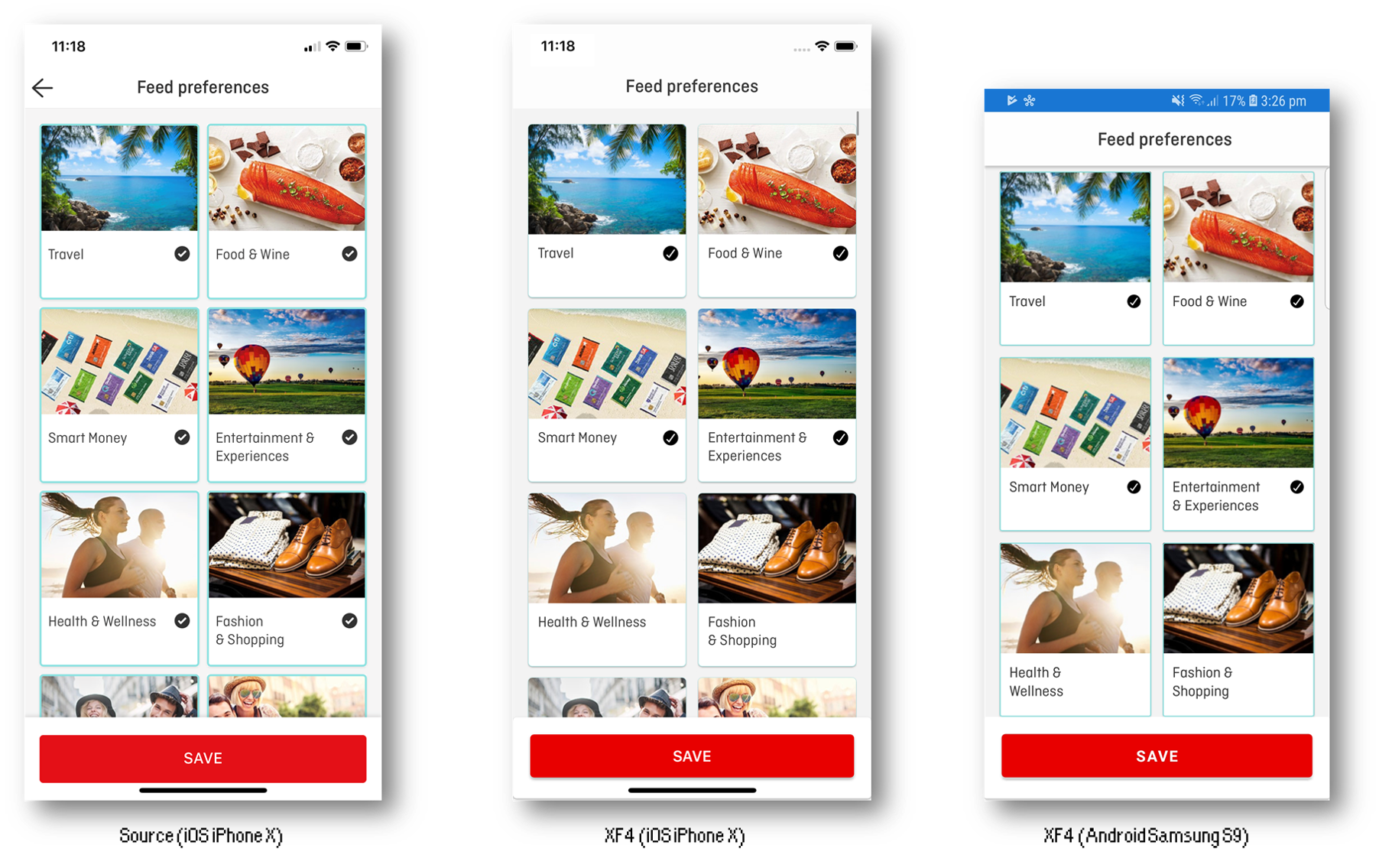
The CollectionView Challenge was similar in concept to the Visual Challenge - take an existing ListView, or screen with a ListView-like structure, and recreate it using CollectionView - again, with comparison screenshots and a writeup on the experience. Once more, I chose to use a screen from the Qantas app:

Although the layout was not terribly complex, it was a good demonstration of the benefit provided by CollectionView because of the grid-like arrangement - prior to CollectionView this would not be possible with out of the box XF controls. I found the control easy to work with and performance to good. My primary feedback on the CollectionView was desire for a hook or hooks to better allow content to be animated - the lack of which being my primary issue with the existing ListView control and the reason that even in Forms Embedding apps I still develop list-based screens natively. Whilst I was able to add a basic fade-in effect using a bit of a hack, it had some undesirable qualities (content 'fading in again' when scrolling back) and would be difficult to extend beyond this. I typically like to stagger animations or use item position to influence the way it appears, and I think there's an opportunity to allow that capability from XF.
Update: after the submission, I took a crack at hacking staggered entry animations in without modifying CollectionView itself, to prove the concept:
The CollectionView challenge technically runs until the end of April, after which I expect there'll be a roundup post similar to that for Visual Challenge.
Overall
I was impressed by the new Forms 4 features. The combination of Visual, a solid CollectionView class (preferably with hooks to enable the kind of animation I described) are excellent additions. Beyond that, my main want is the ability to do shared element transitions - it appears Javier Suárez Ruiz has been experimenting with exactly this and I eagerly await the write up:
Playing with shared element transitions and animations. In addition to BindableLayout, CollectionView, etc. Soon article and sample. #XamarinForms pic.twitter.com/wo9lxFKJvN
— Javier Suárez Ruiz (@jsuarezruiz) April 19, 2019
With all this in the box, the needle continues to swing on choice of Xamarin.Forms vs Xamarin.Native. I am a big fan of my 'Native app shell, Forms-embedded pages' approach, because of the escape hatches it provides. However, as XF Shell matures, and the benefits of letting that be someone else's problem increase, abandoning even embedding becomes a possibility. In any case, I'm pleased to see the progress and to have good options available.